'An artist is a product," said Supichan Rojvanich. The graphic designer du jour is the man who knows how to make that product attractive and wholesome, visually at least. The 31-year-old is the designer behind some of the coolest album covers, for the likes of Slot Machine, Cocktail, Potato, 25hours, Stamp Apiwat, Lula, Ben Chalatit, Two Popetorn, Lipta, among some of Thailand's biggest bands. The list goes on.

Supichan Rojvanich.
"The branding of an artist has become important in the last couple of years because music fans embrace the band they follow as part of their lifestyle," he said.
To Supichan, the branding of an artist creates value and a bond between the band and its followers. Although his main duty is to deliver artistic direction and set out well-designed imagery for a music album, the scope of work he does is on the farther side of visual amendments. "Part of my job is to help the artist craft their identity and build the right image. When an artist becomes a brand, as a designer, I can help position them and create visual interpretation that reflects their individuality and at the same time draws in attention from the listeners," he explained.
Iconic albums in the world often attained that status through their covers: Andy Warhol's design for the Velvet Underground, Robert Mapplethorpe for Patti Smith, Peter Blake and Jann Haworth for The Beatles' Sgt Pepper's Lonely Heart Club Band, to the recent fusion of modern op-art and music such as Banksy for Blur and Jeff Koons for Lady Gaga.
Thai music albums do not have that kind of visual flair and Supichan's expertise makes him a sought-after specialist.
The visual maverick, who recently branched out to design covers and typefaces for a Buddhist prayer's album, studied graphic design at Silpakorn University. He teamed up with his classmates who had similar interests and tastes in music to set up a graphic design collective. Since freshman year, their work focused on visual designs for entertainment businesses including album covers, magazine layouts and movie posters. Yossiri Baisri, Sucharn Chaweewan and Supichan have worked together until now.

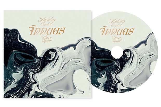
Cocktail’s The Lords Of Misery music formats and promotional materials (2014).
"In those days, when an artist released an album, we had to go check the shelves at the record store," he recounted. "We bought an album usually because of its cover. We were so innocent that we thought the artist did the artwork themselves until later we learned that there are designers who work on cover designs. That sparked off my idea to become one."
Supichan's first artistic cover was for a foreign independent all-female rock group in 2004, while Hangman was the first local outfit he worked for. "I didn't finish the whole project," he admitted. "I was young and immature. When the client wanted to change the design, I didn't want to do it. Also, we saw the concept of 'Hangman' differently. However, I completed the key visual and logo for them."
The young freelancer continued to work on album art which, in his early years, included Smallroom's 2007 Paper Disc, Slot Machine's 2008 studio album Grey and its live performance sequel Machinema. The last album cover put Supichan's name on the map for local music as the artwork impressively illustrates the band's aesthetic and the album's concept.

Key visual for the upcoming Potato Live concert (2015).
After his inventive output for Machinema, Supichan started to look beyond the album cover as a representation of the artist's or band's music. He now collaborates with the artist and record label, engaging in in-depth research in order to achieve an image that has an impact as well as a well-thought logo and other visual executions that reflect the identity of the artist.
Local rock quartet Cocktail is a good example Supichan uses. "Despite a string of their popular hits, people hardly recognised them. They didn't know how the band members looked. So I worked together with the band to reintroduce them."
Three years before the release of Cocktail's latest full-length effort, The Lords Of Misery, which hit the store towards the end of 2014, there was hard work. Supichan and frontman Puntapol Prasarnrajkit settled on a creative strategy to express the essence of Cocktail. Their unique selling points, music style, personalities, the album concept as well as other essential elements are translated into eloquent imagery to mimic the band's identity. The visual metaphor that blends together Gothic art, nobility and emotional darkness was carried across the album's promotional materials including CD packaging, vinyl editions, booklets and posters.
"How the final result turns out -- the artist themselves also plays a vital role. On top of their personal tastes and trust in the designer, they must have a clear understanding of who they are and what they want. Because the role of a designer is not just to create something we personally like, it's our job to bring out their [the artist's] strong personality to attract the core audience."

CD box for Slot Machine’s Cell (2011).
In the deluge of free music streaming on YouTube, the sale of physical albums decline. Music fans turn to the video-sharing portal to listen to latest releases. As a visual specialist in print and music packaging, Supichan, on the contrary, sees it as an opportunity.
"In this age when print materials are believed to be in decline, there are not so many designers in the field. CD packaging and other physical forms of music have however become valuable items -- something to collect," he noted.
Supichan's packaging for music usually plays with printing techniques, materials, textures and geometric forms. "My design for Slot Machine's Grey was somehow a mistake," he recalled. "Because the CD sleeve was in a hexagonal shape and it couldn't be displayed on the shelves. There are also other limitations in production, costs, merchandising displays, consumer behaviour and how to stand out on the shelves that I've learned directly along the way."
More than music, his portfolio expands into other field of graphic designs with corporate logos, commercial projects, magazine designs as well as promotional materials for popular TV melodramas like Lued Mangkorn (Dragon Blood), Roy Fun Tawan Dued (Rising Sun), Sud Khaen Saen Rak and Sam Bai Mai Tao.
For a charitable cause, Supichan has created branding, typeface and artworks for Wat Pathum Wanaram to bring forth fresh, modern aesthetic of the Buddhist monastery with the aim to catch the attention of young crowds. His compelling designs are featured on the front covers and CD sleeves of prayer albums and other fundraising merchandise.
"I don't know which project I feel most proud of," he said. "But I do enjoy working on all new and fun projects. I'm happy when the client is happy and I myself am satisfied with the outcome."
"My next step is however to do something totally different," he added. "Being a graphic designer used to be my dream and I'm now at some point already successful at it. My dream project now is to run a restaurant, a cafe or a small hostel."
"Working in the creative field is short-lived," Supichan said. "Because the job requires you to be fresh and dynamic all the time. When you reach a certain age, say 35 or 40, you start to stay in your comfort zone. You cannot think out of the box or be as fresh as the new generation."
Now, still driven by fresh ideas, Supichan shares his knowledge, tips and techniques by giving lectures at prominent art schools and universities. He and a group of friends who are at the forefront of the industry have founded the Bear Visual Specialist School to share their professional expertise and real-life experiences in creative practices to the younger generation.
Based on the work that you do, which goes far beyond visual art for music, what would you say your job title is? "Designer," Supichan replied promptly. "That's it. It's one small word that well describes it. I'm not trying to be something I'm not."
Supichan Rojvanich
Based in Bangkok
Age: 31
Education: BFA in visual communication design, Faculty of Decorative Arts, Silpakorn University
Recent works:
- Potato Live concert promotional visuals
- Cocktail: The Heartless Live concert DVD packaging
- Num Kala latest single Ploy Mue Chan visual design
- Mild new single Sayonara artwork and band logo
- 25hours Mom & Pop Shop album design
